CATCHIN HANDS MASSAGE BRANDING
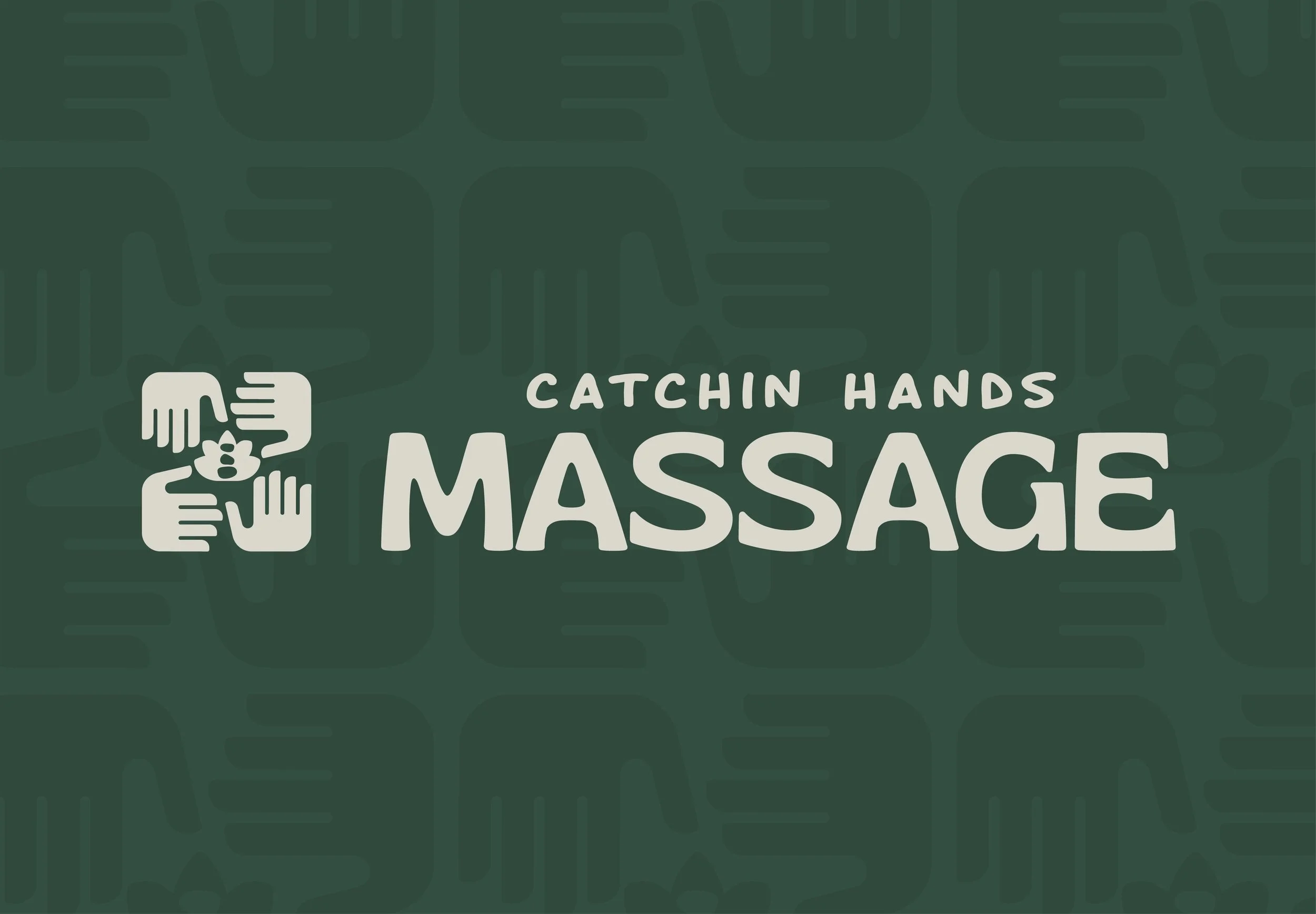
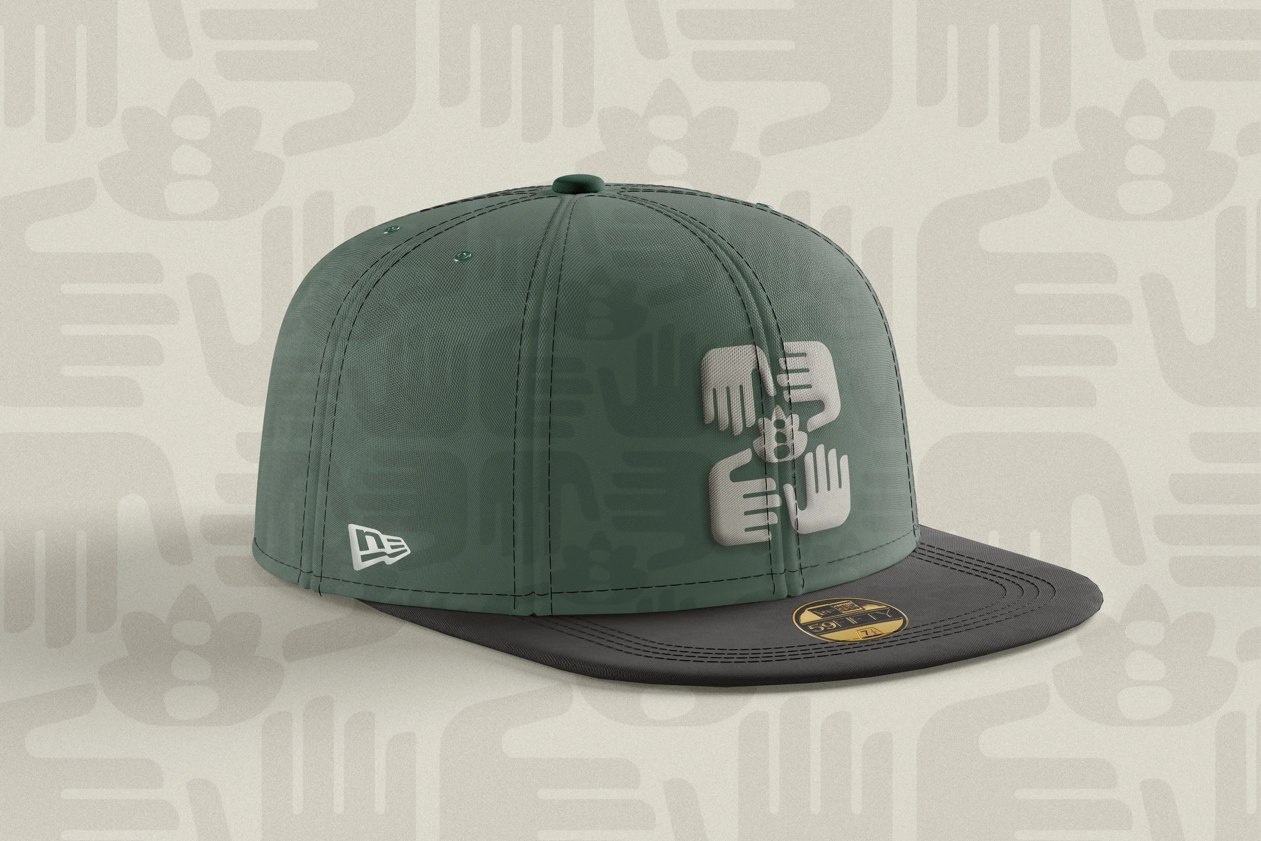
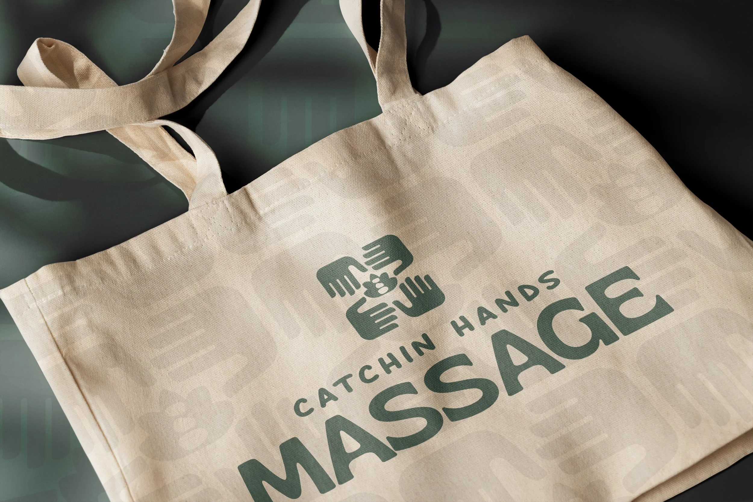
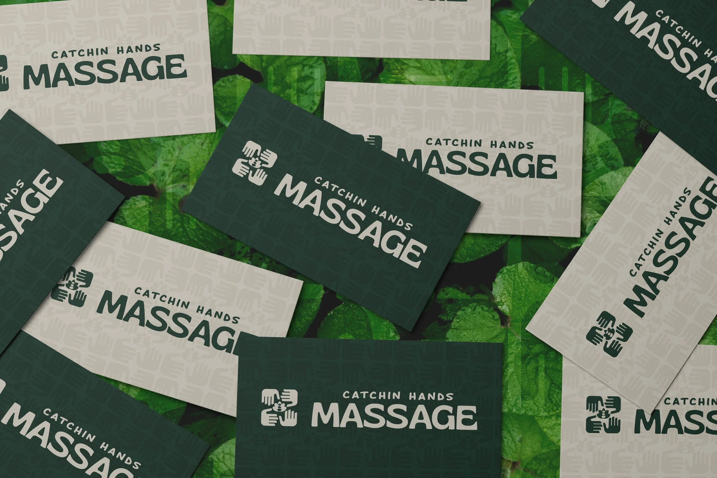
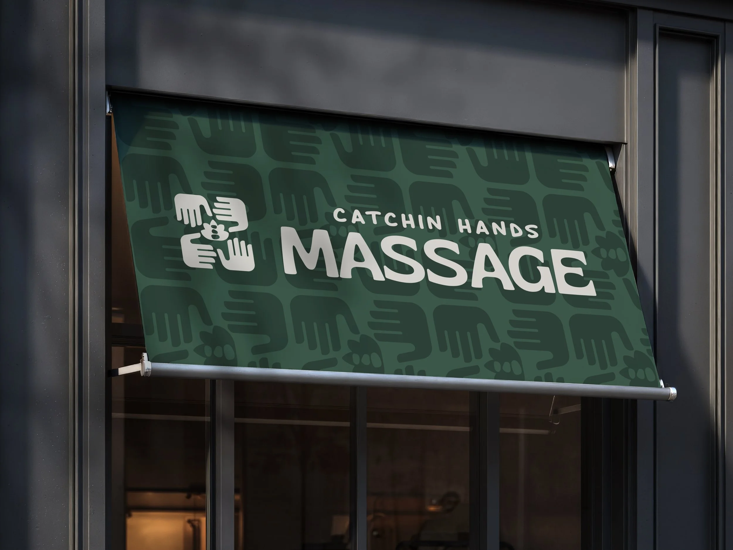
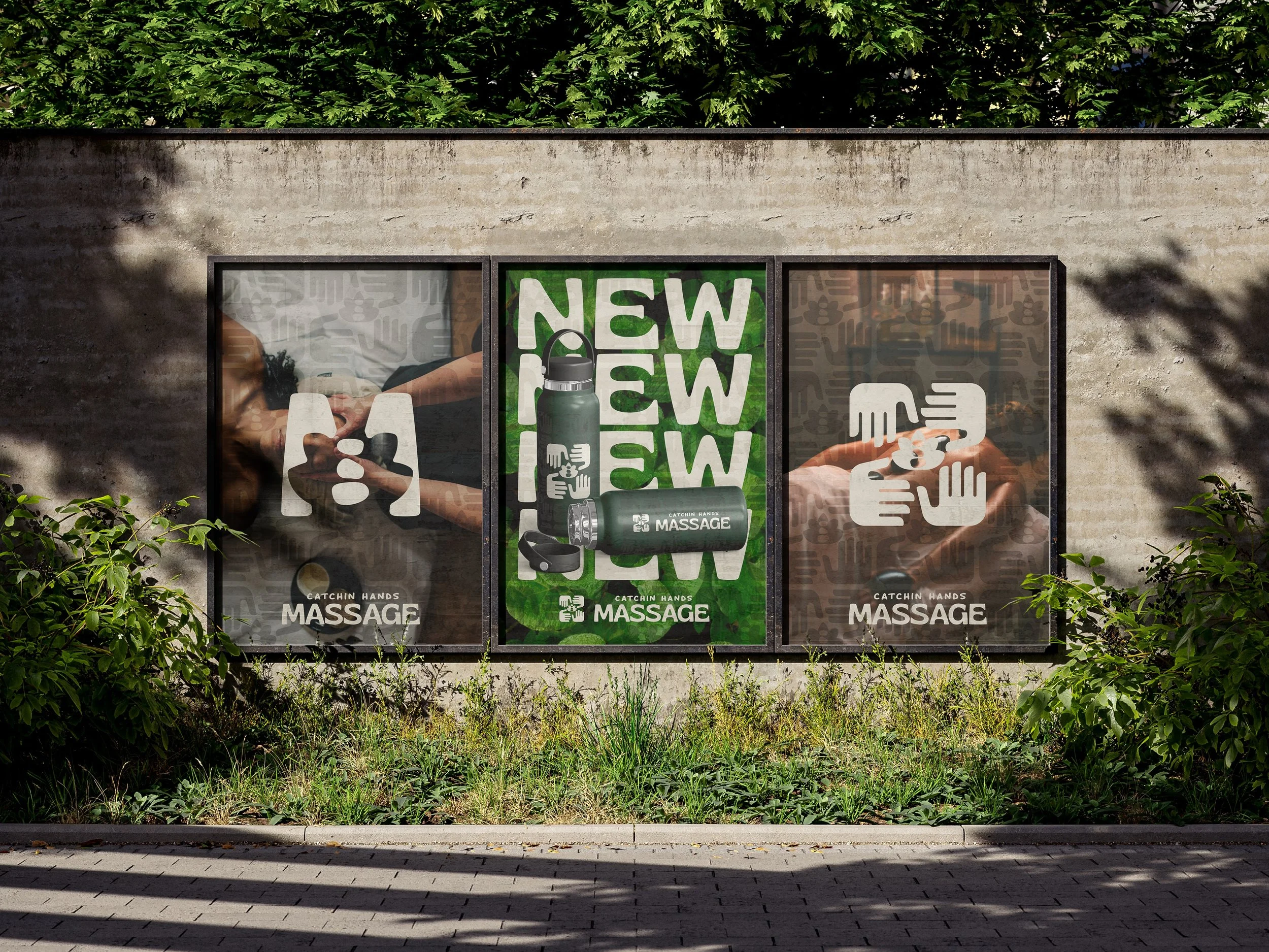
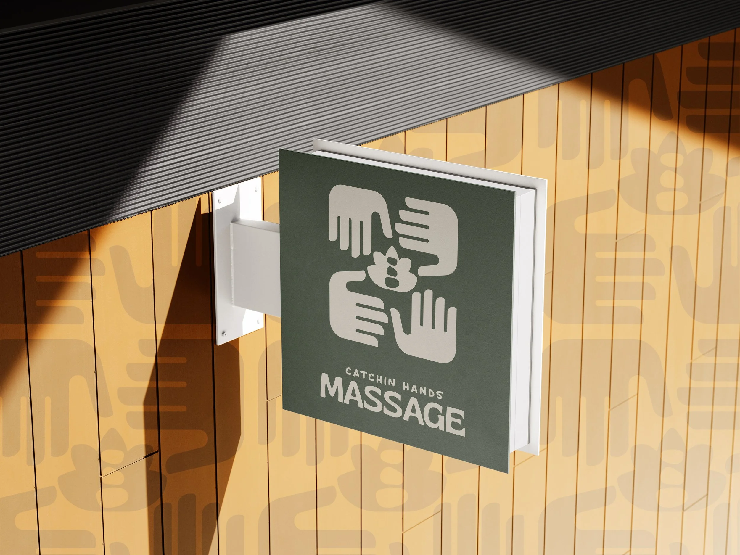
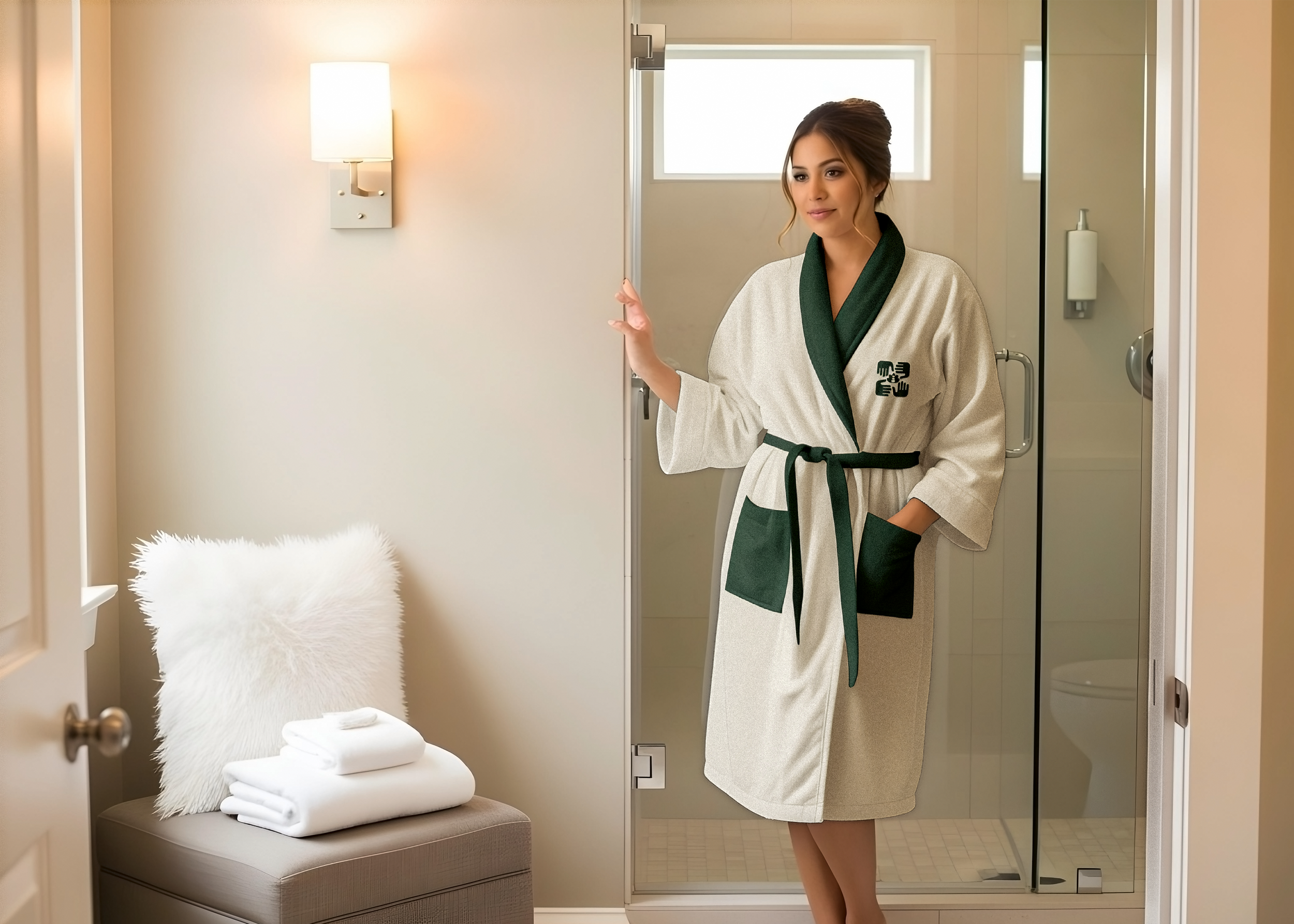
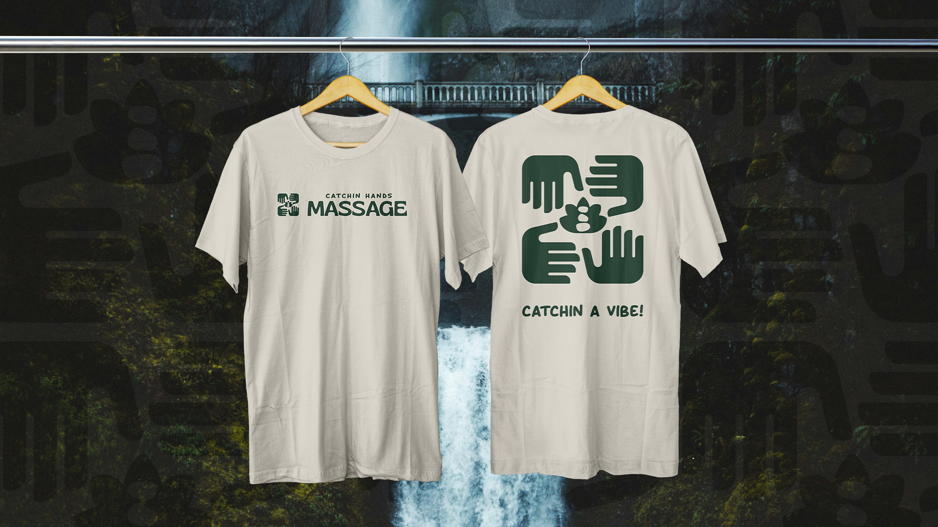
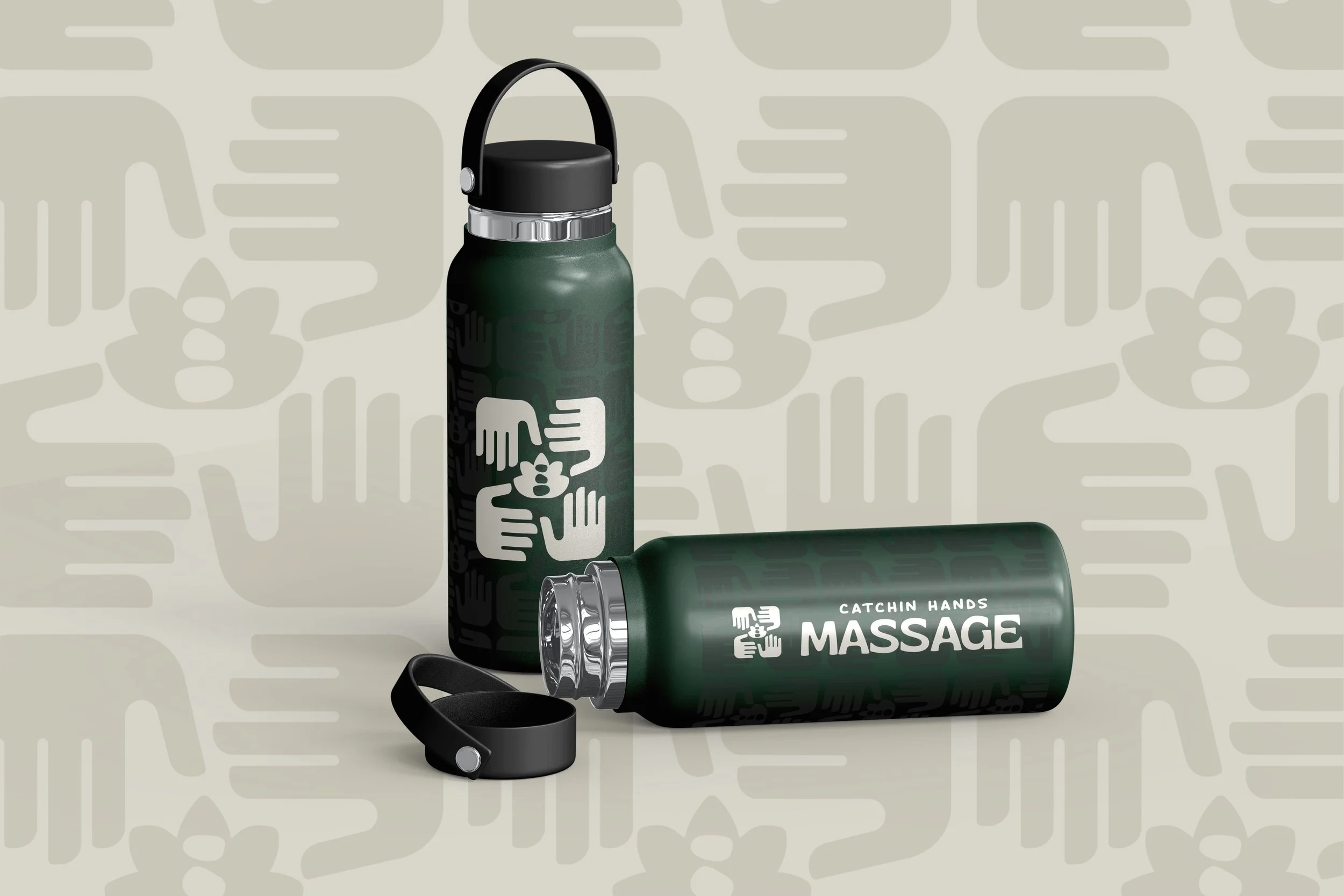
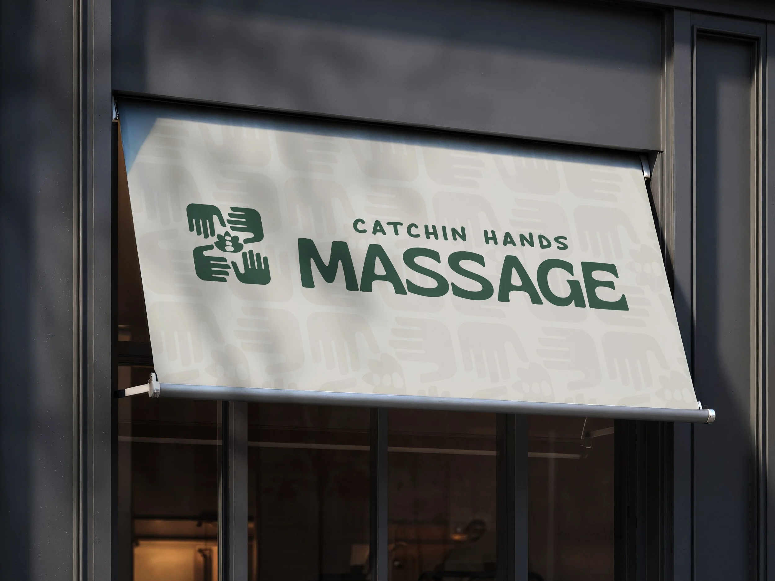
The branding for Catchin Hands Massage is designed to create a comfortable and welcoming environment for customers. This was the primary goal of the entire branding initiative. The brand mark features four hands rotating clockwise, symbolizing the act of catching one another. Additionally, the lotus flower and smooth stones represent peace, comfort, relaxation, and calmness. The chosen color palette reflects the refreshing and organic energy of nature, emphasizing tranquility. The fonts selected convey a modern yet groovy style, complemented by a hand-drawn font that gives the brand a homemade natural feel. This combination is intended to make the brand visually appealing. and engaging for all viewers.
#CATCHIN-A-VIBE